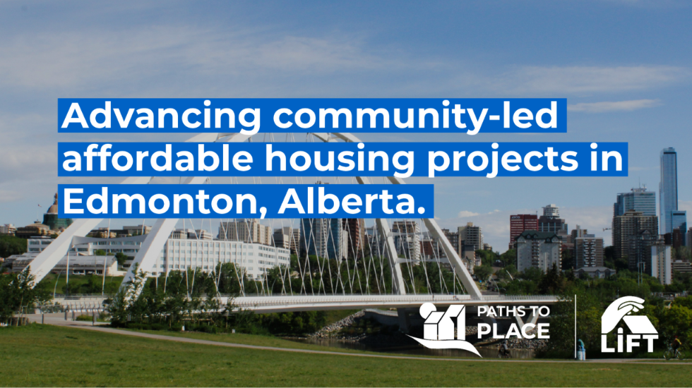
Visual foundations for Affordable Housing in Edmonton, Alberta.
2025 - Ongoing project
Winnie Uong
Jumhpha Hienkeo
Edmonton, Alberta
Empowering local community initiatives by building a brand with their unique needs in mind.
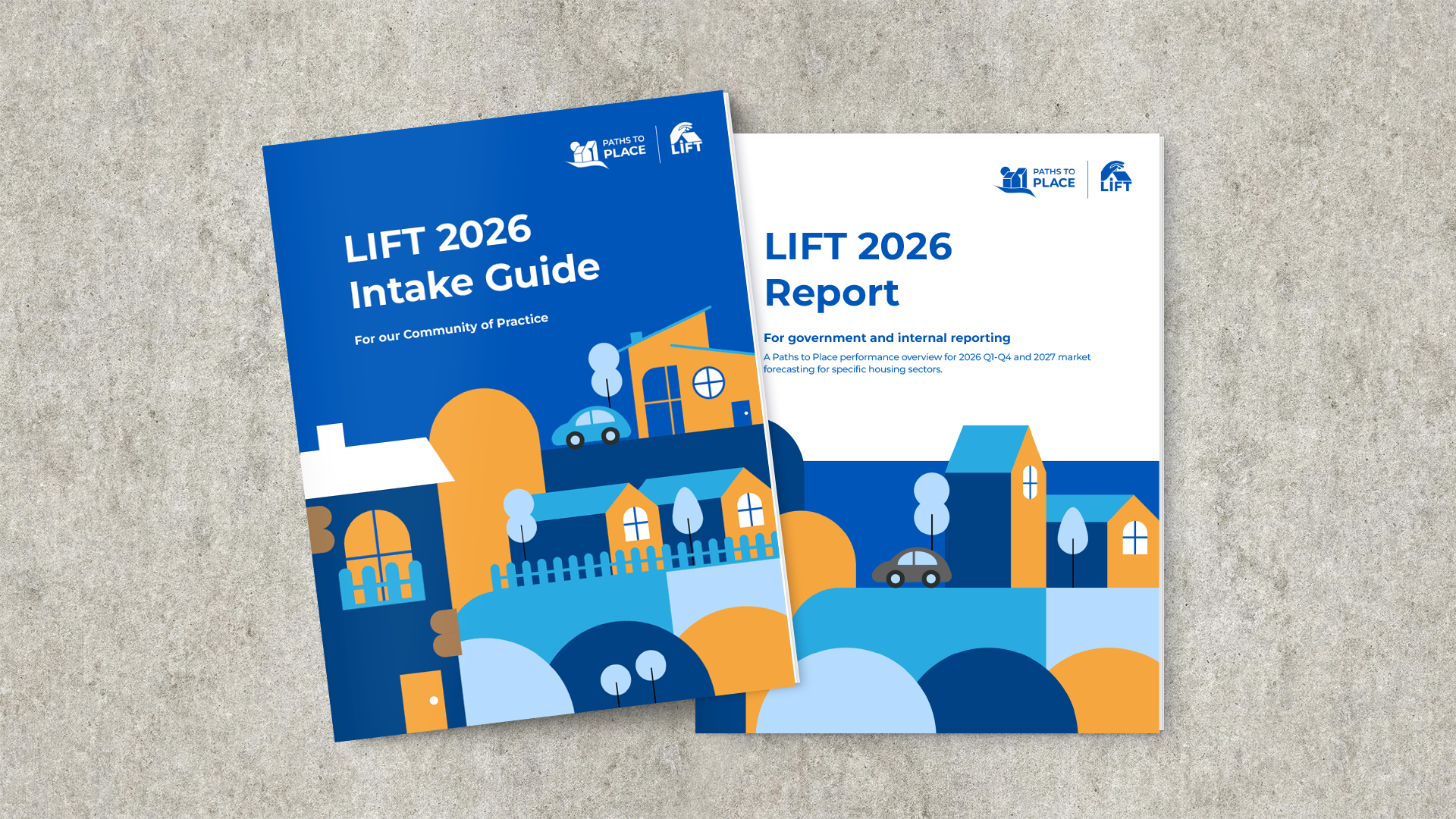
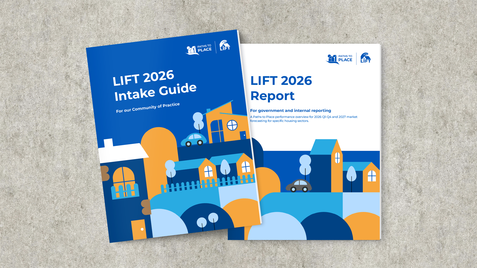
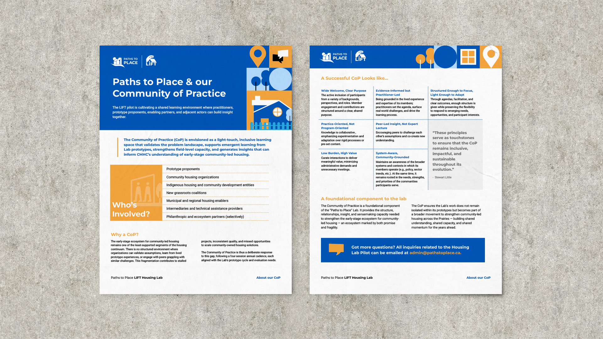
I invited fellow designer Jumhpha Hienkeo to collaborate with me on this project. We developed a holistic branding kit and knowledge products as part of the launch of Paths to Place, one of Edmonton’s latest housing labs. This included creating all required assets for the lab, its initiatives, and technical material that would enhance their mission of providing transformative, affordable housing in our city.

-
![]()
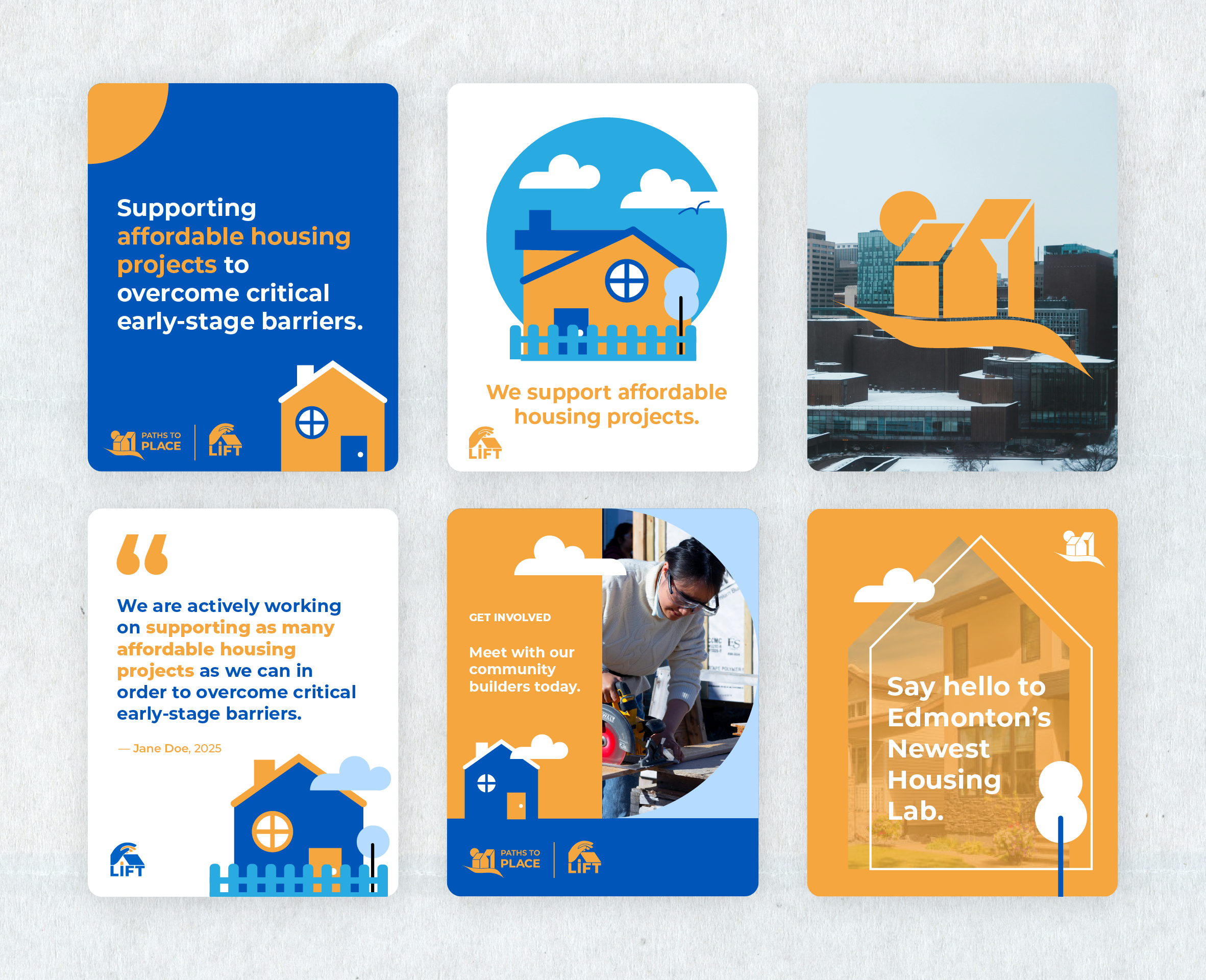
Social Media Illustrations by Winnie Uong
-
![]()
-
![]()
more about the project
Our first iteration at the visual system was a “live” one.
We began our collaboration by understanding the client’s goal for this project: launch the housing lab, execute the first symposium for the LIFT pilot, and have a well-oiled brand within the next two years. The unique challenge of this meant that, from day 1, we had to be molding and scaling the brand in parallel with the lab’s development, and also make key considerations towards usability; the rapidly evolving needs of the lab translated to making logistical choices that ensured anyone on the team, both present and future, would be able to adapt easily.
The final visual system aims to exude trust and could align itself with both institutional audiences and housing industries. Meanwhile, the humanist, hopeful aspect of the lab’s narrative is maintained via our use of high contrast colours and dense, blocky illustrative styles.
Extracting blocks, extrapolating into systems.
After our first round of design and client’s first few months of publishing and development, we regrouped as a team to recalibrate. Two questions emerged: first, how could we further push scalability within the design without constant asset generation? Second, how could we more consistently reflect the diverse aspects of community-led housing?
To answer this, we zoomed into what we had already made. We looked at the blocky objects that already existed in our illustrations and found even more simplified, abstract shapes to play with. With just a handful of new assets, we now had a more robust, mosaic-based system that would be able to bend and flex to most materials in a pinch.
That isn’t to say we ditched the bespoke illustrations completely, but rather, with a little introspection, ended up a smarter, more collaborative visual system.